Published April 14, 2025
Financial markets were slammed by a whirlwind of policy change, volatility, leverage unwind, and benign economic data in the first quarter. The announcement of wide-sweeping tariffs from the new administration from mid-February to early March sent equity markets plummeting lower, along with interest rates, commodity prices (except gold), and projections for 2025 GDP growth. The S&P 500 hit the depth of its selloff (as of the day of this writing) on April 8th, when it closed 18.9% below its all-time high set on February 19th. Other asset classes experienced wild swings as well. The 10-year U.S. Treasury rate rose 47 basis points in only a week, equivalent to a 5% price decline. The US Dollar is also down around 10% versus European currencies this year, while gold is up 23% so far. Closely watched market metrics that signal stress, such as corporate credit spreads and the VIX (a measure of S&P 500 price volatility), are corroborating the fear. Foreign equity markets also sold off about 10% from their highs after a strong start to the year.
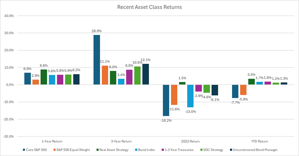
While we certainly did not forecast a rapid sell-off in the S&P, we have been warning of excess concentration and valuation in U.S. markets. Last year, as we rebalanced portfolios, we reduced equity exposure and altered our equity composition by reducing exposure to technology and “large cap growth” stocks and increasing exposure to stocks we believe to be fairly priced within the “value” and small and mid-cap realm. We also used proceeds to buy diversifying assets; assets that behave differently than other assets in the portfolio and thus dampen the effect of market volatility on portfolio values. These include short-term bonds, gold, and foreign stocks. As you can see from Figure 1 on the following page, diversifying assets underperformed over the last couple of years as tech stocks drove the S&P 500 higher. Things are different this year. The S&P 500 is one of the worst performing investments while strategies like Short Duration Credit (SDC, lime green), Real Assets including gold (hunter green), and bond investments (light and navy blue) are outperforming. Even within equities, the equal-weight S&P 500, which includes more small and mid-cap companies, is outperforming the market-cap weighted index, and value stocks are outperforming growth. It pays to have a truly diversified portfolio.
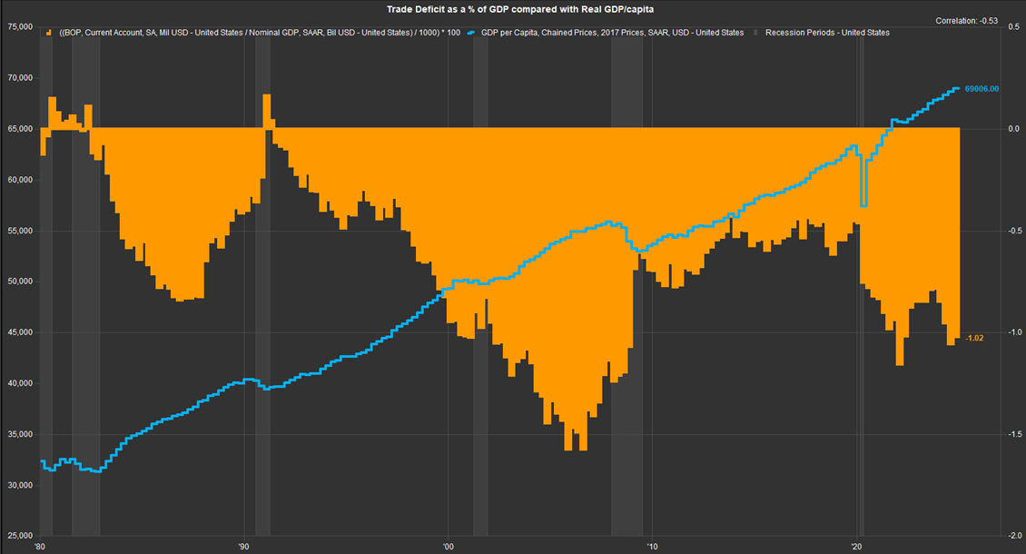
Year to date market performance shows investors across asset classes globally are sending the same message: Tariffs are not good for growth. Global trade exists because some countries can produce goods and/or services cheaper than other countries. This is due to interactions of numerous variables including the local climate, soil quality and terrain, size and skillset of labor force, availability of capital equipment, endowment of natural resources, and ease of transport. When two countries trade instead of trying to produce everything on their own, they gain access to a wider array of goods, at lower costs, and free up domestic resources to focus on their own comparative advantages. The result is the enrichment of both countries, which can now use their freed up scarce resources to produce the highest-value goods and services. Both countries’ income and spending power increase as a result. Even if a country has a trade deficit (imports exceed exports), they are enriched via trade. Importing goods at a lower than domestic cost allows domestic consumers to both buy the item and have extra income to spend on something else. Lower cost imports used as inputs into domestically produced products lowers the cost of production and thus increases total production output. Because the trade deficit is a measure of spending, it correlates well with overall economic activity. In fact, the periods where we see large decreases in the trade deficit are always periods of recession. That is not a coincidence.
The chart below (Figure 2) shows U.S. inflation-adjusted GDP growth per capita since 1980 (blue line). The orange filled section is our trade deficit as a percentage of GDP (a lower number equates to a wider/higher trade deficit). The two series have a -0.5 correlation, meaning they move in opposite directions. When real GDP is growing, the trade deficit widens. When we go into recession, the trade deficit narrows. The trade deficit widened dramatically in the 1990s, going from 0% of GDP in 1991 to negative 1.5% of GDP in 2006. During that same period, real GDP per capita increased over 38%. Recession periods are highlighted in grey on the chart. In each of these periods, the trade deficit narrowed as overall spending fell. This relationship is why global trade flows are closely watched by economists as a signal for global economic activity.
All of that said, I want to be very clear: Tariffs and other measures to protect domestic manufacturing can be necessary in some cases despite their negative economic impact. Unfair trade practices, such as government subsidy of a particular industry, which gives those foreign businesses a cost advantage over domestic producers, which allows it to dump product into the U.S., are justification for the use of targeted tariffs. Furthermore, the idea of protecting domestic production of critical goods and services, especially those related to national security, is strategically sound. Covid taught us the importance of being self-sufficient for critical goods such as semiconductor chips, military goods and equipment, medical supplies, and critical natural materials.
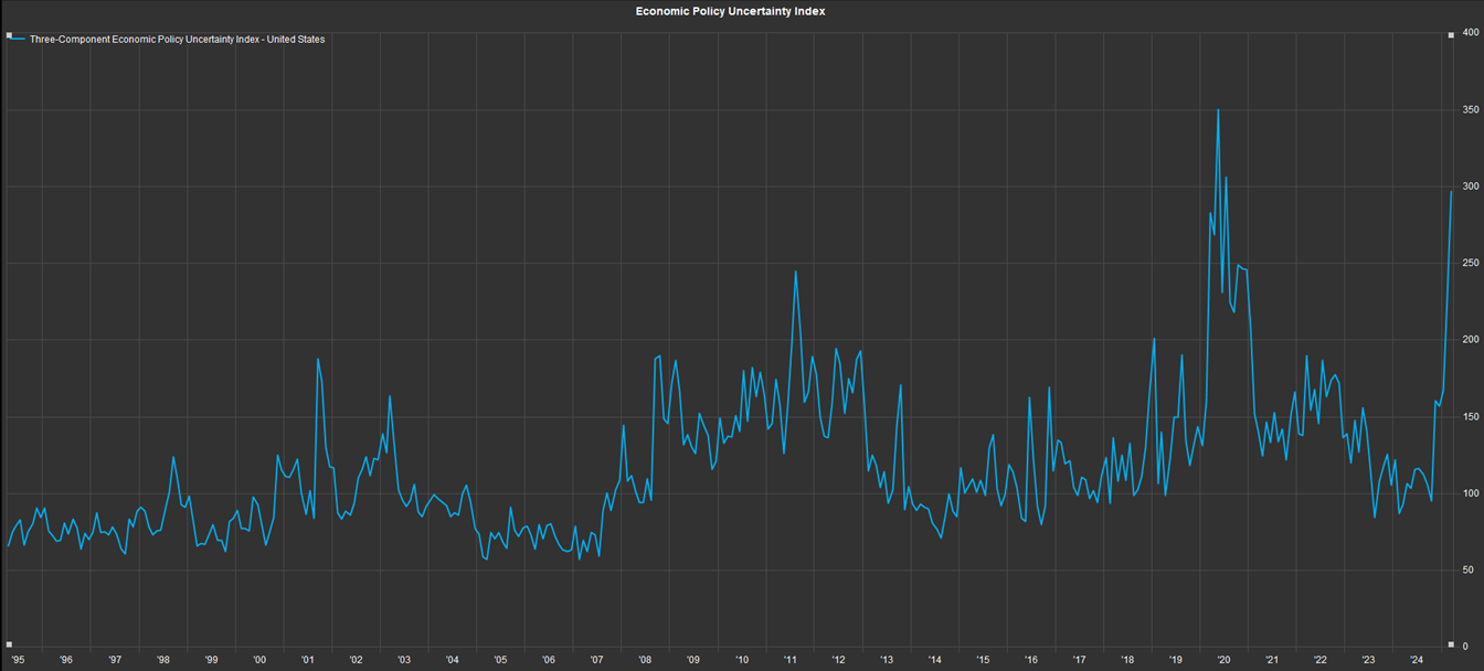
While the magnitude and reach of the proposed tariffs were worse than conceivable, another issue causing concern is the inconsistency in the approach. Investors have had a tough time keeping track of which tariffs are on vs off, which have exemptions for certain products, which are delayed vs canceled, and which are applied to address our fentanyl problem vs our trade deficit. The rapid swing in policy is best shown in the “Economic Policy Uncertainty Index,” an index constructed using a combination of newspaper headlines related to policy uncertainty, upcoming tax code changes, and the dispersion of individual forecasts for inflation and government spending. This index has spiked to its second highest point ever; it was higher only during covid (see Figure 3 on the previous page). Investors do not like uncertainty. We calculate an investment’s fair value by discounting future cash flows back to the present at our required rate of return. If we have no visibility on the timing and level of future cash flows, the risk (potential loss) of the investment increases, and we would require a higher rate of return on a given investment in response. Higher required returns are achieved via lower prices, as we have seen across the market. However, it is important to remember that uncertainty does not mean bad outcomes will happen, only that investors have no conviction in either direction, and thus sell down assets until the price sufficiently compensates them for the risk.
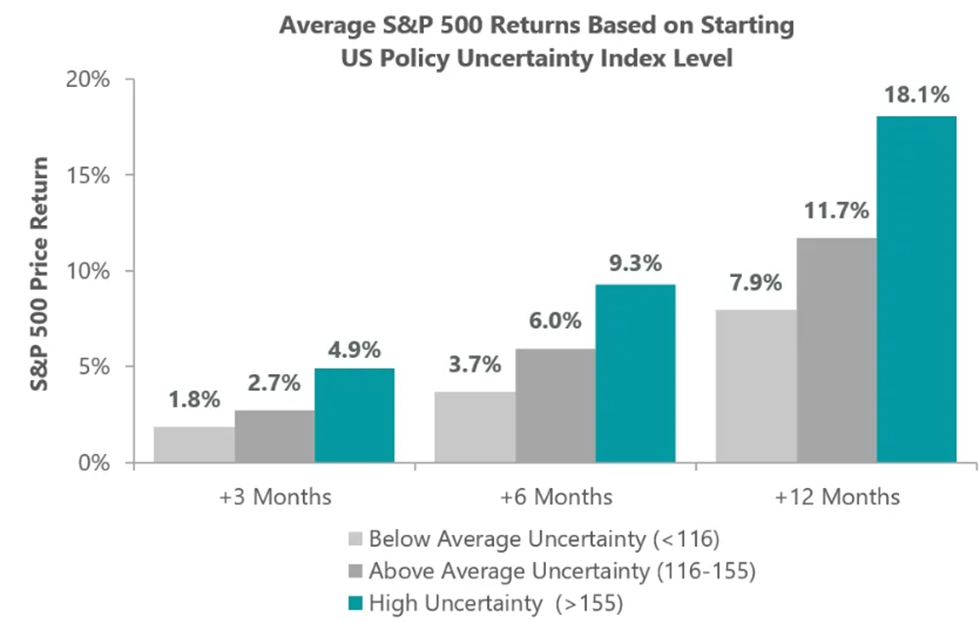
The good news is that future returns have historically been strong after periods of uncertainty. The chart on the following page (Figure 4) shows S&P 500 returns 3, 6, and 12 months after the Economic Policy Uncertainty Index overtakes certain thresholds. Since 1985, when the index hits a level above 155, 1-year returns average 18%. Looking back to Figure 3, the index is currently near 300. We not only see strong returns after spikes in the Economic Policy Uncertainty Index, but also after other signals of panic flare up, including drops in consumer sentiment, spikes in investor bearish sentiment, and spikes in volatility measures like the VIX. It’s obvious why: when people panic-sell assets, they drive prices to irrational levels (especially if whatever sparked the panic plays out without issue, which is often). Asset prices change when investors’ expectations change. When asset prices reflect panic and pessimism, you can be confident you’re not buying at the height of expectations but also be comfortable knowing there is a lot of room for expectations to improve from current levels. This is why investors who “buy low and sell high” do well. They buy when there is panic and sell when there is euphoria, always taking the opposite side of lopsided, consensus sentiment, because lopsided sentiment is unsustainable.
Sources: Macrobond, S&P, FactSet, Economic Policy Uncertainty.
While we hope to see the rebound soon, it is not guaranteed. This volatility has been induced by tariff announcements that as of now, have no end in sight. However, we believe this administration wants to see a strong and prosperous American economy and thus will change their stance on tariffs after seeing the market reaction and hearing the concerns of business leaders. Given the 90-day pause in reciprocal tariffs, exemptions for electronics announced a few days later, and recent calls from the administration to begin negotiations; it is plausible the administration is past “peak tariff” and will begin making deals to ease trade barriers for all parties. This would be a tremendous result for the economy and markets. Until then, we will monitor market fluctuations daily. We are not day traders. We are not trying to guess daily market moves, but we will rebalance portfolios when market value fluctuations cause drift in portfolios’ asset allocations and offer long-term investors attractive prices. The 9% S&P 500 gain when the 90-day pause was announced on April 9th is a great lesson on why investors cannot try to time markets and must commit to riding out future volatility and sticking to their long-term financial strategy. We always appreciate your trust during normal times, but we are especially grateful for it during times of stress.
Thank you.

Jeff Cone, CFA®, CAIA®
Chief Investment Officer
BEAM Wealth Advisors / Benedetti, Gucer & Associates
(All historical returns, economic data, and other data cited in this piece were from Ycharts or FactSet, unless otherwise noted).